Southern California Edison - MySCE Native App Redesign
Southern California Edison (SCE) was looking to redesign their MySCE native app experience with the goal of encouraging customers to use the app instead of calling a representative to manage their account.
Role: Lead Experience Designer Agency: WONGDOODYDuration: Sep 2022 - Apr 2023Challenge
Define core archetypes and understand their needs, goals, and challenges to help improve the MySCE app user experience.
Goals
Improve app architecture
Provide an overall better user experience
Improve UI design
Streamline key action / reduce clicks per action
Increase Daily Active Users
Key focus areas for redesign
Commonly used feature takes a lot of clicks to accomplish
Lengthy process
Users find it difficult to navigate through the app. Their mental model of how to take specific action are not aligned with architecture of the app
Poor navigation
UI does make it difficult for users to use the app. Information that is important are hidden or displayed in a deficient manner making it hard for users to do basic action
Lacking UI
Colors, text, buttons are not up to accessibility requirements
Interface fail accessibility
Users are often redirected to the sce.com website to finish an action breaking the seamless experience
The app sends users to website
Users voiced useful features are not available to them. For example, most users cannot track their usage on the app even though data show it as a popular feature
Missing key features
Archetypes
Single Account Holder - Users with one household and one type of energy contract to their account
Single Account Holder - Users with one household and one type of energy contract to their account
AND
Net Energy Metering (NEM) account - users selling any surplus power generated by their solar panels
Multi-Account Holder - Users with more than one household and/or more than one type of energy contract to their account
Multi-Account Holder - Users with more than one household and/or more than one type of energy contract to their account
AND
Net Energy Metering (NEM) account - users selling any surplus power generated by their solar panels
Refining the FLow
Reducing unnecessary clicks and screens users interact with for an action


Laying out features for Home,
Wireframes
Wireframe
The goal of this workshop is to share research, align on challenges, and brainstorm solutions
How might we educate users on the benefit of automated payments?
How might we help the audience determine which partners are right for them?
How might we inspire the audience to reach out for information?

Key Patterns
A focus group and interview were conducted to identify demographic and overlapping patters of current card holders and prospect customers

Content Hierarchy Testing
To create connection with users and reduce bounce rates, strategic placement of content on each page are considered.
Putting the most important information at the top of the page and the least important at the bottom. The content needs to answer questions users may have and direct them to the right destination.

Wireframe Testing
Hypothesis
Users need more information on product in order to self-select
Usability Test Objective
A/B Testing is used to determind how much information prospect needs inorder to convert and to test what language users respond to for this product

Test Findings
Test A was overwhelming for users landing on the page for the first time.
However, more informative content where helpful. Providing details based on needs, like in Test B, made it easier for users to quickly decide which product to proceed with
Insights
User needs landing page to cater to their individual journey
Each users are consuming information differently depending on what they are looking for. This page needs the flexibility to cater to all users landing on this page.
This page needs to help guide users to the right product for them through self-selection
Users need a mental model of what to expect after enrolling for the program
This gives feeling of ease and control to the user. Another benefit to help set user expectation and lower disatisfaction
Provide more informative resource
User can benifit from FAQ on this pager. It positions American Express as an expert in the fields and use the page as reference to valuable content for users

Final Design
Final Wireframe

Final UI
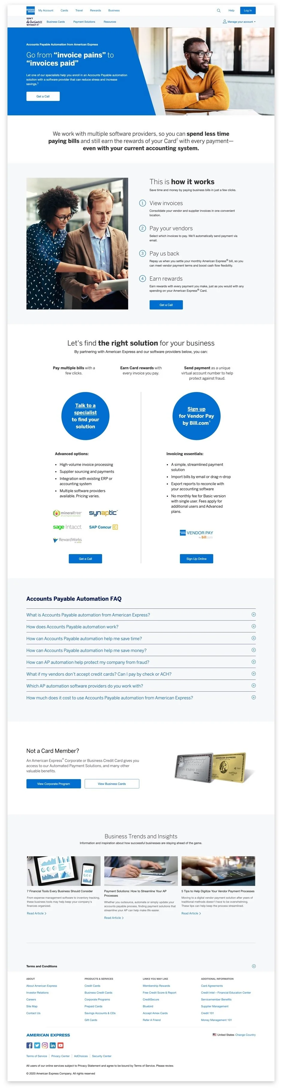

Results
200% increase in conversion
Measurements
User sign-up (self select to the correct business size)
Measured over 1 year