Zipdrug by Anthem Inc.
Redesigning the SaaS Experience for Zipdrug’s Internal teams
Zipdrug software is used for Medical Adherent and Telecommunication.
The current software experience is difficult for their internal (Zipdrug representatives) and external (Pharmacist) users to engage with. As a result, Zipdrug is seeing a loss in engagement, lack in retention, and critical data errors from its users.
Role: Founding product designerCOmpany: Zipdrug by Anthem Inc.Duration: Jun 2020 - Nov 2020
Phase 1: Discovery
Problem Statement
As a Zipdrug Representative, I want to multitask so that I can call more patients in one day.

Background
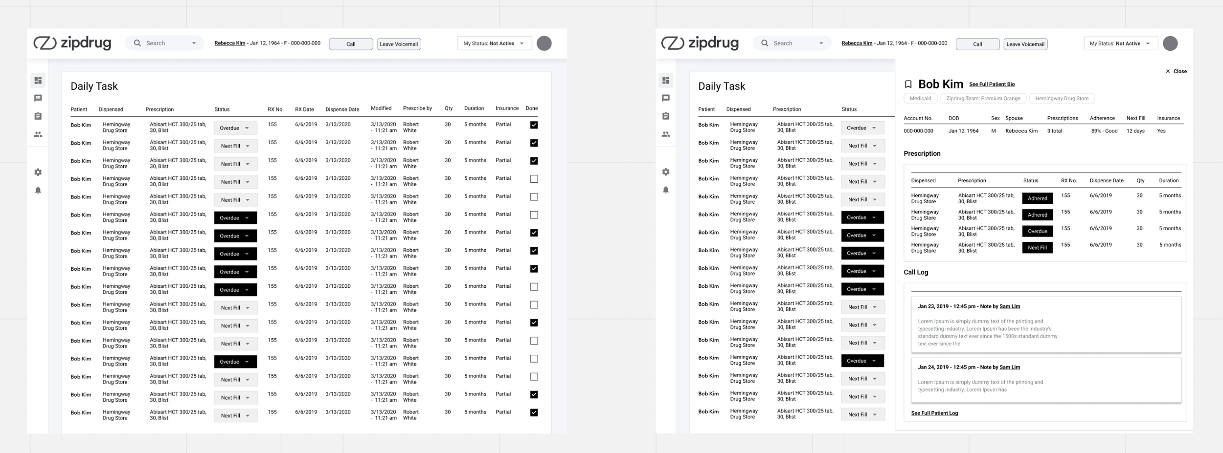
Zipdrug representatives are tasked with a daily list for outgoing calls. Zipdrug reps are encouraged to make as many calls as possible in a day. They are looking for a solution to help them work faster without sacrificing the capability to see critical patient information.
User Research
Conducting user interview for a deeper understanding of the user
Interview Methodology
Methodology: 30-45 minutes video interviews with Zipdrug representatives who have used the software for more than 3 months
Ranges from Lead, mid-level, and junior representatives
5 total interview
Goal
user needs, pain points, day-to-day and blind spots to the software
Reps need the ability to move quickly from one patient to the next
Their workaround is opening 2 windows one to see the patient information and another is multiple tabs for their upcoming calls
Multiple tabs cause confusion and potential breach of HIPAA
Multiple windows opened causes lag to the software
Reps are looking for multitasking capabilities
In the current software, Zipdrug reps are limited with to seeing one patient per screen. As a workaround, representatives are opening multiple tabs for their next call
Key Findings
Feature Focus
Users had different mental model performing specific tasks
Solution: Customization to meet their unique needs when performing a task would be allowed in later release
Allow customizable interface
Users find toggling back and forth between pages in the software made their task more difficult and increase the chance of mistakes
Solution: Simplifying interface from the current that force user to a new screen for every interaction to one screen with half screen interactions
Workflow friendly interface
measurement of daily users and continuous use
Software retention
For measuring the internal team (Zipdrug’s rep) capability to utilize the software efficiently
Time per patient
Phase 2: Define and Ideate
Participant: Product Team, Product Manager, Product Lead
Ideation Workshop

Users can access patient information on the same screen as the daily task list
Workflow Concept

Concept Key Features
The call center is added to the header bar and doesn’t interact with the workspace
Expanded / Collapsed screens are split for multitasking
List-display medical information and are able to be used to mark off adherent
Final Flow
Phase 3: Testing

Conducting User Interview
Hypothesis
Reps want to see the task list and patient bio clearly
Reps are not going to interact with Call Center during their workflow
What are we looking to learn
What do reps want to see in their workflow?
Are our design assumptions “Reps are not going to interact with Call Center during their workflow” aligned with their preferences?
How do Reps feel about the half-screen workflow?
Are there any missing actions they wished they had?
Testing Round 1 - Initial Concept
Co-designing session with participants

Testing Round 1 - Findings

Hypothesis
Reps want to see the task list and patient bio clearly
Reps are not going to interact with Call Center during their workflow
What are we looking to learn
What do reps want to see in their workflow?
Are our design assumptions “Reps are not going to interact with Call Center during their workflow” aligned with their preferences?
How do Reps feel about the half-screen workflow?
Are there any missing actions they wished they had?
Testing Round 2 - On hover feature
Testing UI and Necessary Information

Testing Round 2 - Findings

Hypothesis
Reps would need features such as patient upcoming and overdue fill, Call Center - “call” and “leave a voicemail”, and “see full bio” CTA
What are we looking to learn
How much information do reps need on hover cards?
What Call Center action do Reps need?
Testing 3 - In workspace Call Center
Testing UI and Necessary Information

Testing Round 3 - Findings

Hypothesis
Reps would like to see past conversation notes because patients aren’t going to speak to the same Rep every time
More actions from Call Center are needed
Expanded, closed, and collapsed views are useful for Reps
What are we looking to learn
Do Reps need to see past conversation notes?
First pass at button color exploration for Call Center - do these colors make sense to user?
Should Call Center have capabilities to close? Should it collapsed?
Are placement of Call Center useful?
Phase 4: Iterate
Refining Call Center
Defining Call Center Task Flow
Using task flow to break down the steps of this feature

Version 2 Visual Design

Call Center - Flow

Refining Split screen Concept
Identifying User Stories

Flow and Annotations
